
Introduction: The Impact of Color in Restaurant Design
Color isn’t just about aesthetics—it influences mood, appetite, and how long customers stay. The right color palette can energize a fast-paced café, add elegance to fine dining, or create a warm and casual feel in a family-friendly spot. In the UAE’s competitive F&B scene, your restaurant’s colors can set the tone for your brand and help shape unforgettable dining experiences. In this guide, we’ll break down how to strategically choose a palette that enhances your concept, supports your branding, and transforms your space into one your guests will keep coming back to.
Understand Your Restaurant’s Brand & Concept First
Before choosing colors, you must understand your restaurant’s identity. What cuisine are you offering? Who’s your target audience? Is the vibe elegant and upscale or fun and casual?
Your color palette should align with your overall brand story. For instance:
- Organic or health-focused restaurants benefit from earth tones, greens, and neutrals to reflect freshness and wellness.
- Fast food outlets often use bold and energetic colors like red and yellow to encourage quick dining.
- Luxury fine-dining spaces lean toward rich hues like deep blues, golds, and blacks to evoke sophistication.
At Exotic Interiors Studio, we begin every project by defining the brand’s DNA to ensure the design, including colors, expresses it consistently across the entire customer journey.
The Psychology of Color in Restaurants
Different colors evoke different emotional and behavioral responses—something especially powerful in a dining environment:
- Red & Orange: Stimulate appetite, energy, and movement. These are ideal for quick-serve or high-traffic spaces.
- Green: Associated with health and calm—perfect for vegan or clean-eating establishments.
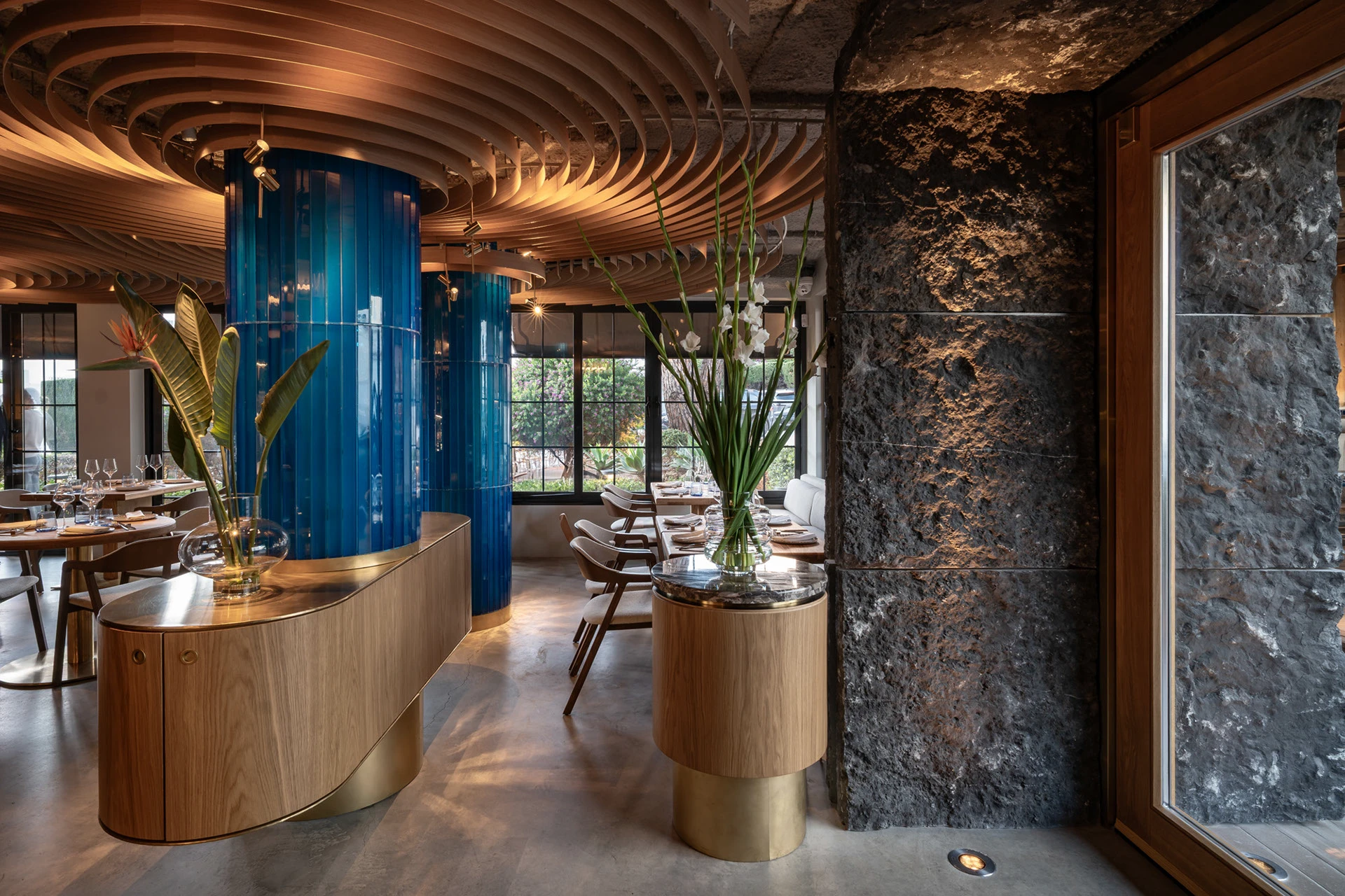
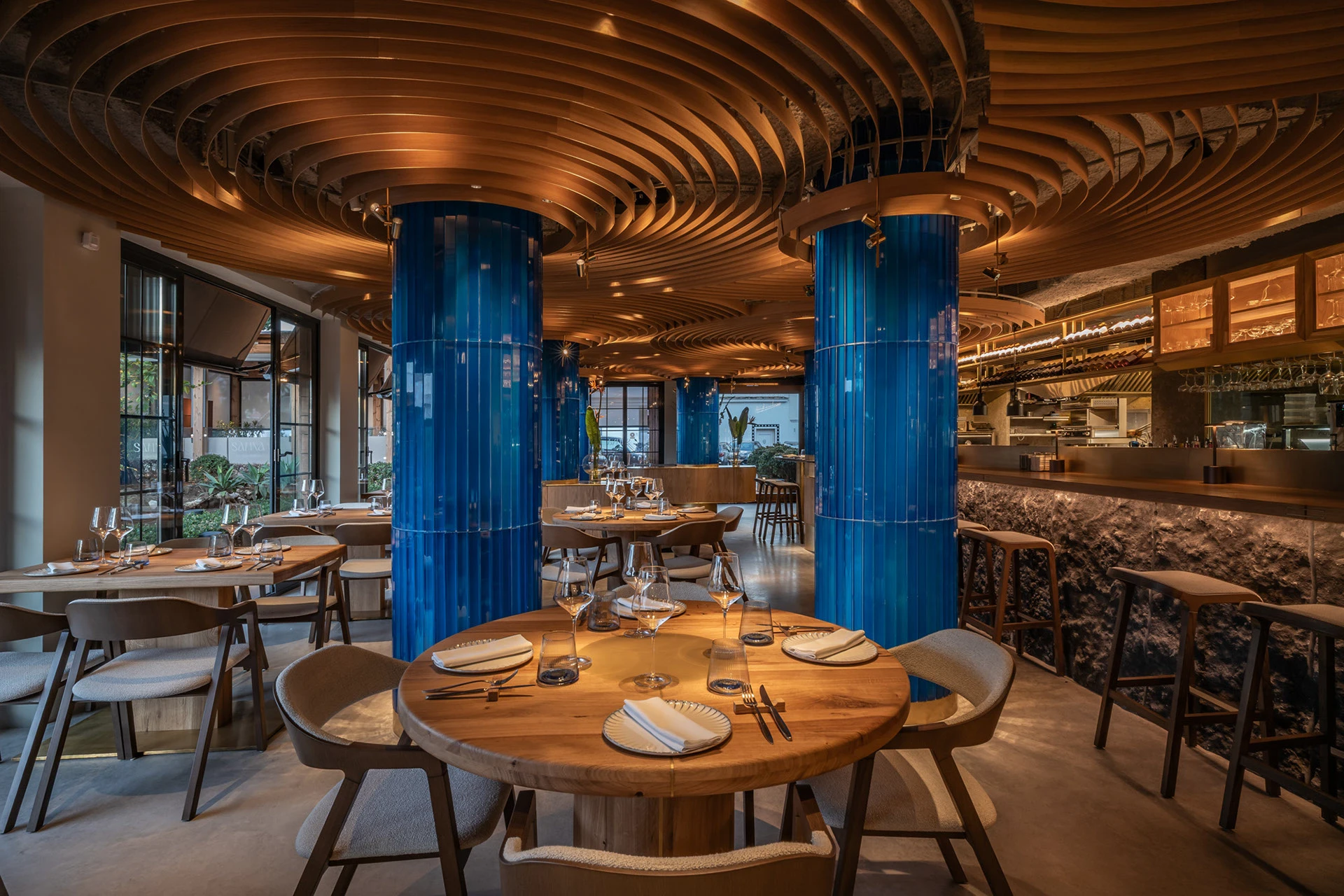
- Blue: Calming and elegant, though known to suppress appetite. Use subtly in upscale or tranquil settings.
- Yellow: Bright and joyful, it grabs attention and boosts energy. Great for accent walls or decorative elements.
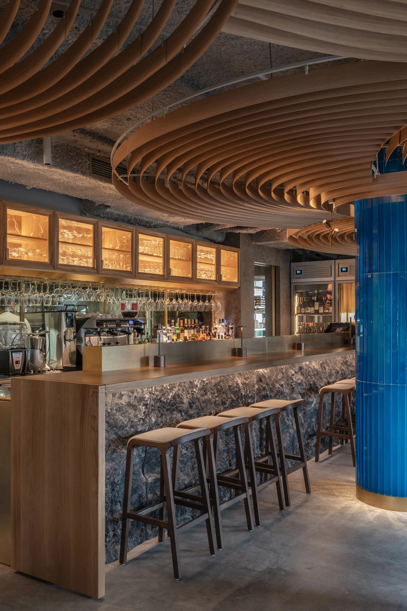
- Black, Navy & Dark Tones: Create a sense of luxury and exclusivity. Used effectively in high-end lounges and fine dining.
Exotic Interiors incorporates these principles strategically—whether designing a casual burger joint or a luxury seafood restaurant in Dubai—ensuring that color not only looks good but works very well.
Match Color with Lighting & Space Size
Color alone isn’t enough—it must complement the lighting and proportions of the space.
- Lighter hues make small spaces feel larger and more open.
- Darker colors can add intimacy and drama but require strong lighting to avoid feeling enclosed.
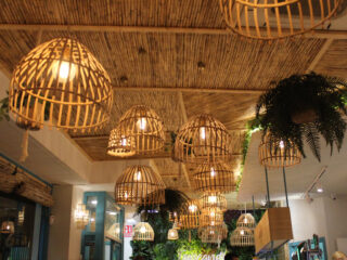
- Warm lighting enhances reds, oranges, and woods, while cool lighting balances blues and greys.
At Exotic Interiors Studio, we carefully coordinate lighting design and color selection to create mood and functionality. In a compact dessert café, we might use white and pastel tones with soft lighting to feel airy. Meanwhile, in a spacious steakhouse, dark palettes paired with statement lighting can create bold impact without sacrificing visibility.
Cultural Considerations in UAE Hospitality Design
Designing in the UAE means being mindful of cultural values and regional aesthetics. Colors like green and gold hold positive associations in Arabic culture, symbolizing prosperity and elegance.
Arabic-inspired interiors often incorporate neutral tones, warm metallics, and natural textures, providing a balance between modern appeal and cultural depth. For fusion concepts or international brands, it’s important to adapt the global brand palette to local expectations—especially in family-oriented or community-focused spaces.
At Exotic Interiors, we guide clients through culturally appropriate design decisions that still maintain brand identity. Whether it’s integrating traditional patterns into a modern cafe or using regional materials in a boutique bakery, our goal is to design spaces that resonate locally while standing out visually.
Popular Restaurant Color Schemes & What They Communicate
Certain color combinations work especially well depending on the restaurant type. Here are a few that Exotic Interiors has successfully implemented across the UAE:
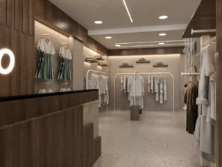
- Neutral + Wood Tones → Great for contemporary cafés and brunch spots. These colors promote calm, warmth, and approachability.
- Black + Gold Accents → Create a sense of luxury and exclusivity. Ideal for fine dining, fusion, or nightlife-driven spaces.
- White + Pastels → Bright and inviting. These schemes work beautifully in dessert bars, bakeries, and Instagram-friendly cafés.
- Terracotta + Olive Green → Rustic and warm, suitable for Mediterranean or Middle Eastern eateries.
Each palette communicates not just style, but intention. For example, a bold black and red interior may feel too aggressive for a wellness-focused café, but perfect for a grill restaurant. Our team at Exotic Interiors ensures every palette fits the brand message, customer expectations, and spatial layout.
Tips for Creating a Balanced Palette
A well-balanced palette isn’t about using one color—it’s about creating harmony. Follow the 60-30-10 rule:
- 60%: Dominant color (walls, large surfaces)
- 30%: Secondary color (furniture, upholstery)
- 10%: Accent color (decor, artwork, lighting)
Add texture through tiles, fabrics, woods, and metals to make even neutral palettes dynamic. Don’t rely solely on paint—consider how finishes and materials bring color to life. Exotic Interiors provides mood boards, material samples, and lighting simulations to help clients visualize the final result.
Testing your palette in the actual space or under simulated lighting conditions ensures that what looks great in concept works beautifully in execution.
Why Work with Exotic Interiors Studio for Restaurant Design
With years of experience designing F&B spaces in the UAE, Exotic Interiors Studio understands the perfect mix of branding, ambiance, and practical functionality. We go beyond aesthetics, aligning your restaurant’s color palette with customer psychology, cultural context, and operational flow.
From fast-casual dining concepts to fine-dining flagships, we handle the full journey—from mood board to final fit-out. Whether you’re opening your first outlet or revamping an existing brand, our team delivers thoughtful, high-performing interiors that leave a lasting impression.
Conclusion
Choosing the right colors isn’t just about style—it’s about storytelling, psychology, and business success. A well-designed palette can increase customer satisfaction, enhance brand recognition, and even boost sales.
Let Exotic Interiors Studio help you create a color journey your guests will remember.